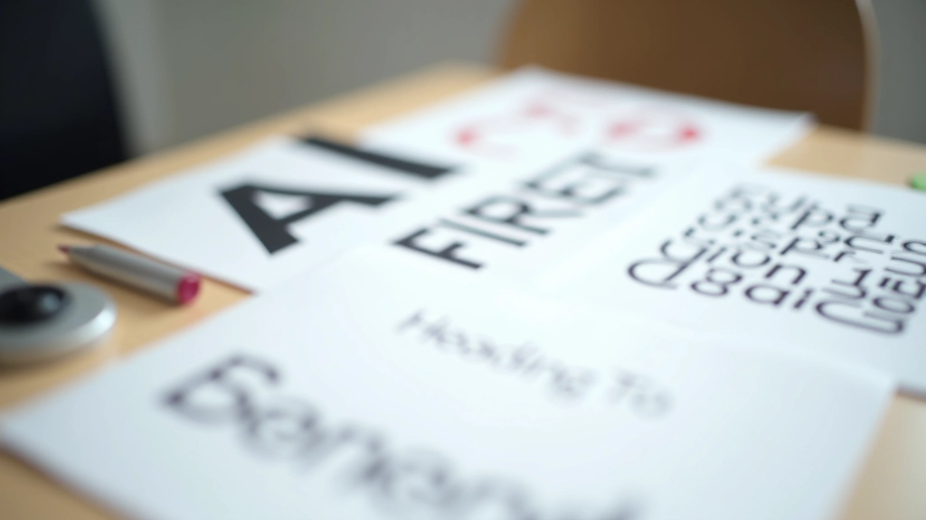
Understanding Font Categories
Typography isn’t just picking fonts that look nice. It’s about understanding how different typefaces communicate and serve your design purpose. When you’re starting out, it’s easy to feel overwhelmed by thousands of font options. But here’s the thing — most fonts fall into just a few main categories, and knowing these categories makes selection way easier.
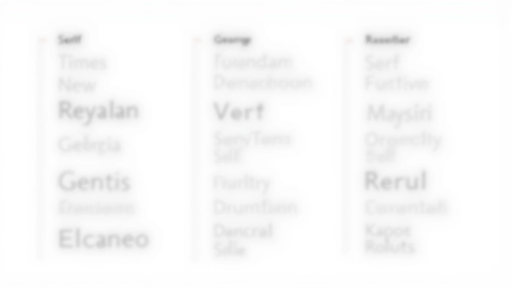
Serif fonts have those little feet at the ends of letters. Times New Roman, Georgia, and Garamond are classics. They’ve been around since the printing press era, and they feel traditional, elegant, and trustworthy. Sans-serif fonts (meaning “without serifs”) like Helvetica, Arial, and Roboto are clean and modern. They work everywhere — print, web, signage. Then you’ve got display fonts, which are the showstoppers. These aren’t meant for body text. They’re headline fonts, decorative fonts, and personality fonts. Script fonts, geometric fonts, grunge fonts — these grab attention fast.
Pro tip: Most successful designs use one serif and one sans-serif together, or two sans-serifs with different weights. Display fonts work best as accents — use them sparingly.
The Art of Pairing Fonts
Pairing fonts is like matching wine with food — you want complementary flavors, not competing ones. The biggest mistake beginners make? Pairing two fonts that are too similar. If both fonts look almost the same, there’s no visual contrast. Your design feels boring and unintentional.
The golden rule: create contrast. You want your heading font and body font to look noticeably different. If your heading is a bold, geometric sans-serif, your body text should be something friendlier and more readable. Weight matters too. A thin, elegant display font pairs beautifully with a solid, dependable sans-serif for body copy. Don’t pair two light fonts together — you’ll lose hierarchy.
Classic Pairing
Serif heading (Georgia) + Sans-serif body (Open Sans). Traditional, professional, readable.
Modern Pairing
Bold sans-serif heading (Montserrat) + Light sans-serif body (Lato). Contemporary, clean, friendly.
Creative Pairing
Display font accent (Playfair) + Minimal sans body (Roboto). Magazine-style, editorial, distinctive.
Font Sizing and Line Spacing Matter
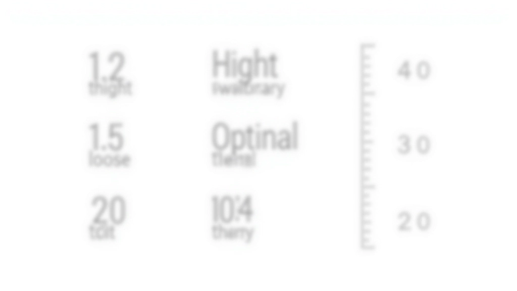
You can have perfect font choices, but if your sizing is off, readability suffers. It’s not just about making headlines bigger and body text smaller. There’s actual hierarchy to consider. Your h1 headline should be roughly 2.5 to 3 times the size of your body text. That’s usually somewhere between 32-48px for web headlines, with body text at 16px.
But here’s where most beginners stumble: line spacing. The space between lines (called leading, pronounced “ledding”) isn’t just decorative. It affects readability dramatically. For body text, aim for 1.5 to 1.6 times your font size. So if your body text is 16px, your line-height should be around 24-25.6px. Tight line spacing feels cramped. Too much space wastes real estate. Finding that sweet spot takes practice, but once you get it, your text becomes genuinely easier to read.
Practical Tips for Font Selection

Start with Google Fonts or Adobe Fonts if you’re just beginning. These libraries have excellent filters, and many fonts come in multiple weights (light, regular, bold). That’s crucial for creating hierarchy without adding new typefaces.
Test your fonts in context. Don’t just look at them in a specimen sheet. Put them in a real layout with real copy. See how they feel on a website, printed, at different sizes. What looks beautiful at 72px might feel clunky at 14px. Always test.
Limit yourself to 2-3 fonts maximum. I’ve seen designers use five different typefaces and wonder why their design feels chaotic. Constraint breeds clarity. Pick one serif (or none), one primary sans-serif, and maybe one display font for special moments. That’s enough.
Pay attention to x-height — the height of lowercase letters like ‘x’. Fonts with tall x-heights feel more open and friendly. This matters when you’re pairing fonts. A font with a very short x-height might look squeezed next to one with a tall x-height.
Start Experimenting
Typography is one of those skills where knowledge matters, but practice matters more. You can read all about font theory, but until you sit down and actually pair fonts, test them in layouts, and see what works, it won’t stick. The good news? You’ve got unlimited fonts available right now. Start with three pairing combinations you like. Use them in a project. See how they feel. Then try three more. Within a month of actual practice, you’ll develop an instinct for what works and what doesn’t. That instinct is what separates designers who know typography from designers who just pick fonts.
Educational Note
This guide provides foundational information about typography principles and font selection. While these guidelines are based on established design practices, typography is ultimately a creative discipline. Every project has unique requirements, and what works for one design may not work for another. We encourage you to use this information as a starting point and adapt principles based on your specific project goals, audience, and brand guidelines. Always test your typography choices in actual use cases before finalizing designs.